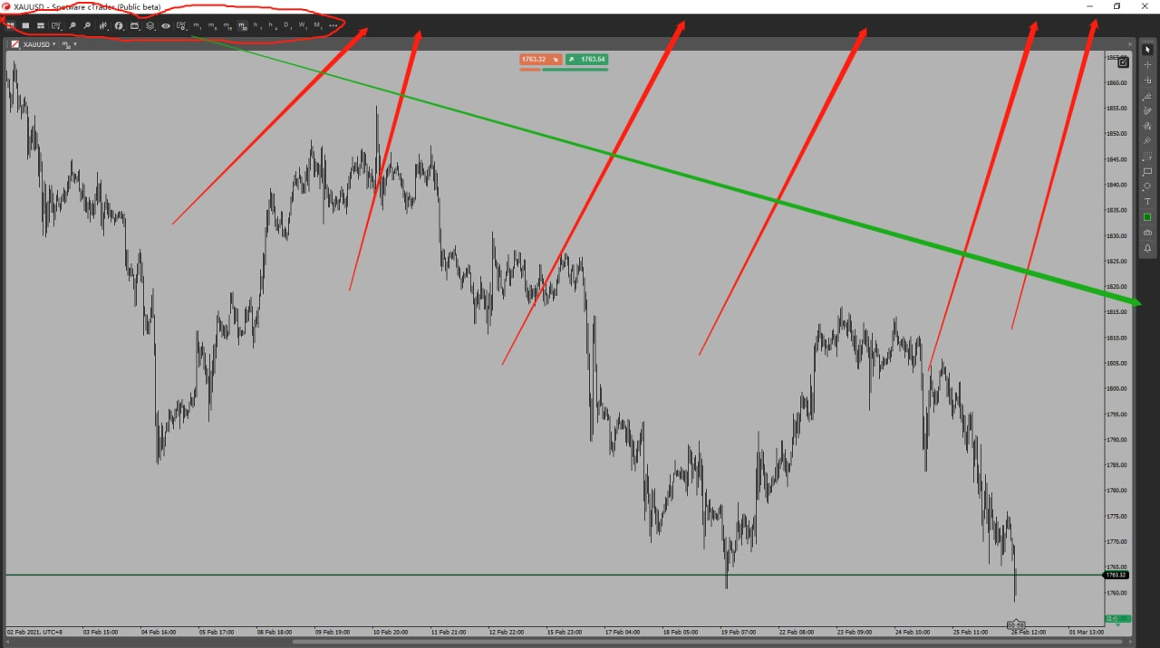
Suggestions for chart window layout.
26 Feb 2021, 08:45

There is a white status bar at the top of the window itself. This toolbar below does not support movement, and the toolbar on the right can be moved, with an extra part of blank area in the lower right corner, but the toolbar above takes up a lot of space, and a lot of space on the right is wasted. It is equivalent to having three toolbars on the top part, which is extremely wasteful of chart space. I hope the development team will improve it, thanks.
cMirror
@artcfd
