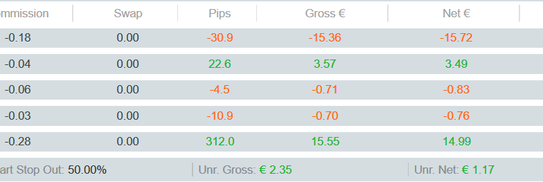
In the light theme: Green and red should be darker for better contrast
Created at 09 Feb 2021, 08:23
GR
In the light theme: Green and red should be darker for better contrast
09 Feb 2021, 08:23
Please consider changing the colors to a darker green and red.
Especially the red is on the grey has too little contrast. Even worse over RDP.
Thanks!

cTrader
@GridSurfer
