closer zoom on bar charts, easier to read Y scale. And other minor suggestions in the chart interface.
closer zoom on bar charts, easier to read Y scale. And other minor suggestions in the chart interface.
06 Feb 2021, 00:40
ive been using TradingView charts and love how they function.
Here there are easy to read pip jumps in the grid, like 5, 10, or 20 or 50 pips. as You drag the Y scale up and down to adjust viewing.
good for scalpers to quickly do mental calculations to distance and positioning.
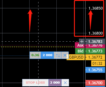
Here Y scale was squeezed, clear to see its 1 pip change on the horizontal grid scale.
Also ability to zoom in a lot more to bars makes it easy for daytraders to see current action in close. thats my number one hope, bigger chart zoom, having a big 32 inch monitor doesnt make things any better when ctrader limits chart zooming.
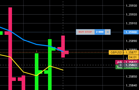
another example of price separations on Y scale. here 10 pip changes. easy to read.
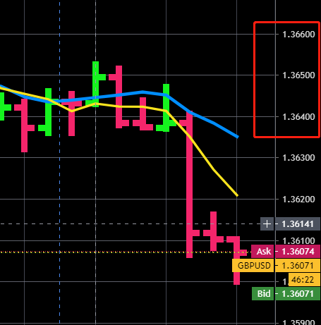
in Ctrader, the bid/ask and entry lines and SL lines are all red and green, if we had hte ability to adjust their thickness and colour,
would be a lot easier to read and understand especially when prices (bid ask) and entries or SL are close to each other.
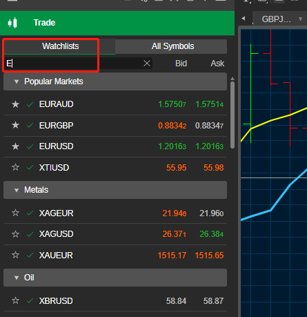
with shortcuts, SHIFT Q, W, E when you open the trade watchlists, shift Q, the cursor defaults to the search box,
so if you try to hit SHIFT E then it just enters E into the search box, try making the cursor be the default after the shortcut, so that you are automatically back in the trade window with cursor, and you can use SHIFT E OR SHIFT W to work the other panels.
would like to see the Price here as well, you can click and hold to reveal the price, but better to just see it always since thats what is most important, I already know the lot size i`m trading consistently. And perhaps put this on the right side like in tradingview, because at the moment i`m looking left and right along my long screen and its like watching a tennis match, my head is bouncing left and right just to see the price the entry is at.

changing font size is limited, but it also does not change the size of the pop up entries when clicked, they remain very very small. hard to read.

great software all in all, cant beat ctrader automate, but these graphics improvements would make interacting with charts more enjoyable and easier to do calculations in my head from the Y scale.
Thanks for reading.

Bots4Us
07 Feb 2021, 11:49 ( Updated at: 21 Dec 2023, 09:22 )
RE:
EagleMoxy said:
Hi EagleMoxy,
Thank for raising. I couldn't agree more. Particularly on font size of the pop up windows. No issue for hawk-eye, but ...
Should be an easy fix.
Thx, Bots4Us
@Bots4Us