cTrader workspace utilization
14 May 2021, 13:55
(Reposted this article in the Suggestions section)
Hello dear cTrader Team!
I've loved the platform since the very first day I tried it!
Please let me suggest a possible optimization for beautiful cTrader interface.
There are unused spaces at the edges of the interface. Why not use them for toolbar disposition to maximize the area of the charts.
Please look at the pictures.
I use 2 monitors, a large one as primary and a smaller monitor as secondary, this is the primary monitor:
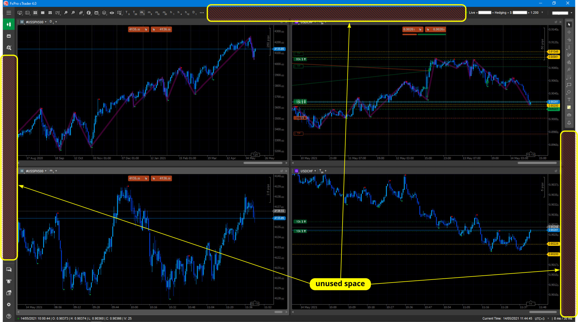
-
This is the secondary monitor:
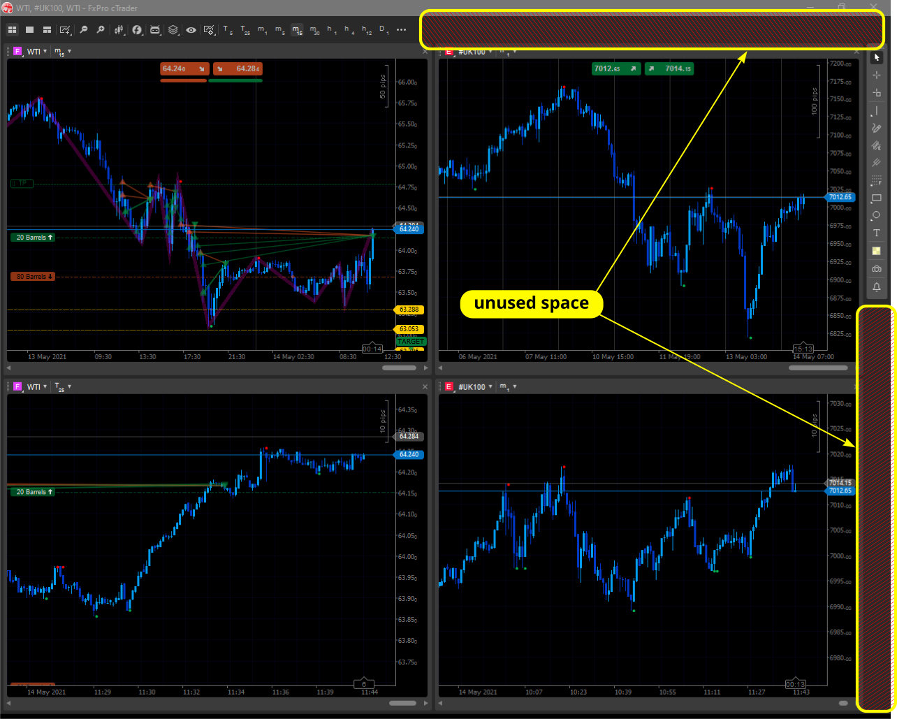
-
New interface for the primary monitor:
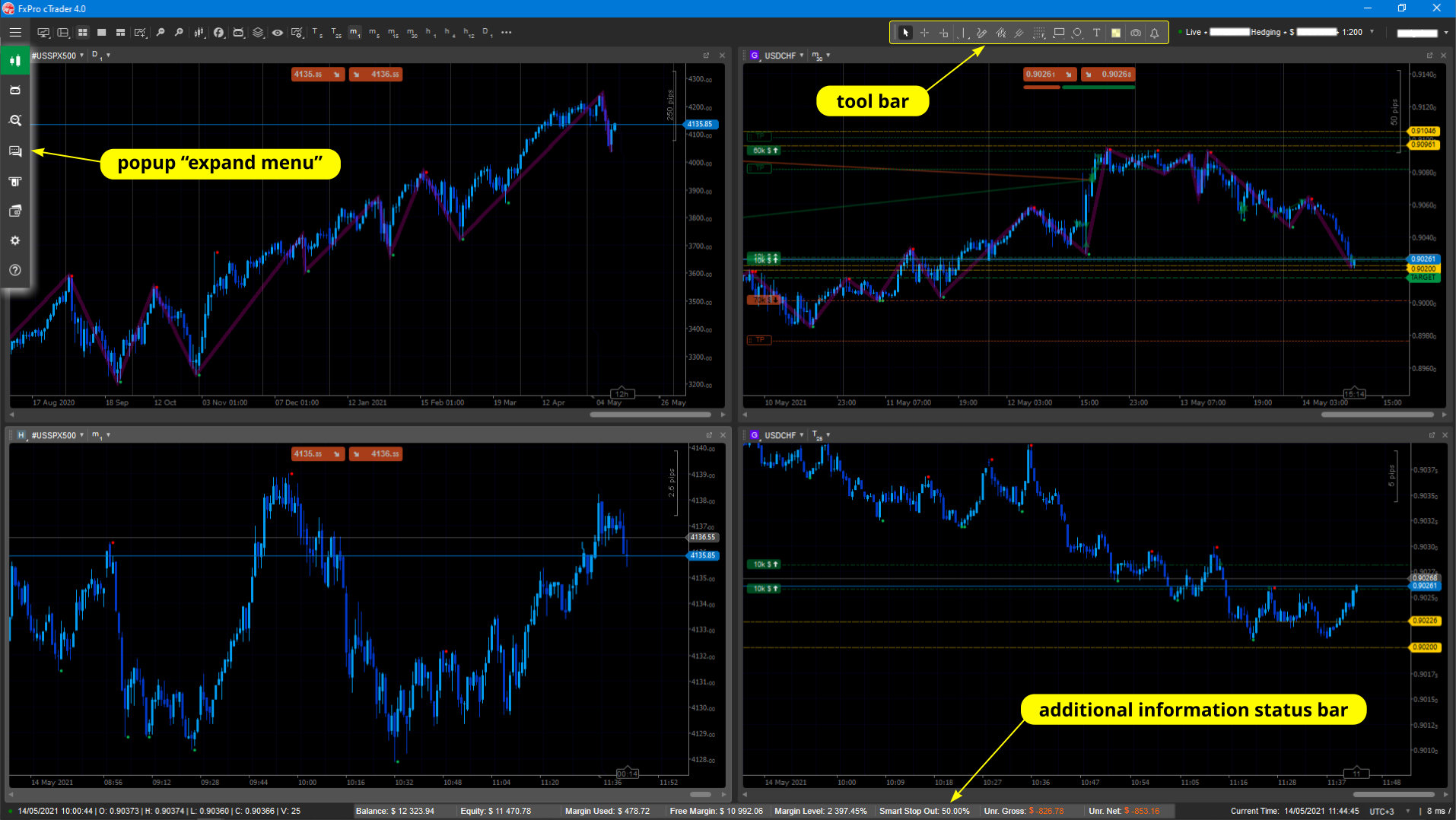
-
New interface for secondary monitor:
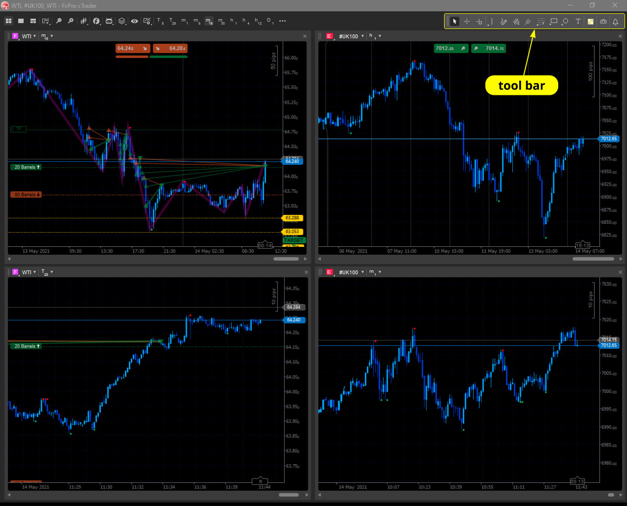
-
The "expand" menu:
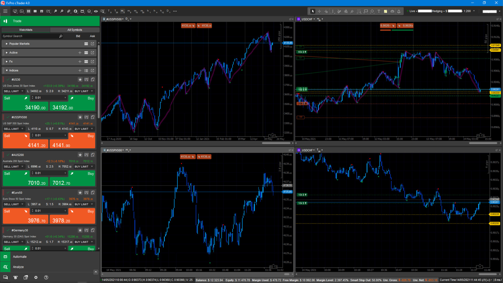
-
One more thing - if it were possible to automatically hide the top menu and then appear when the mouse pointer touches the top edge of the workspace - a kind of real "fullscreen" mode with more area for charts.
Something like this (please note information area on status bar):
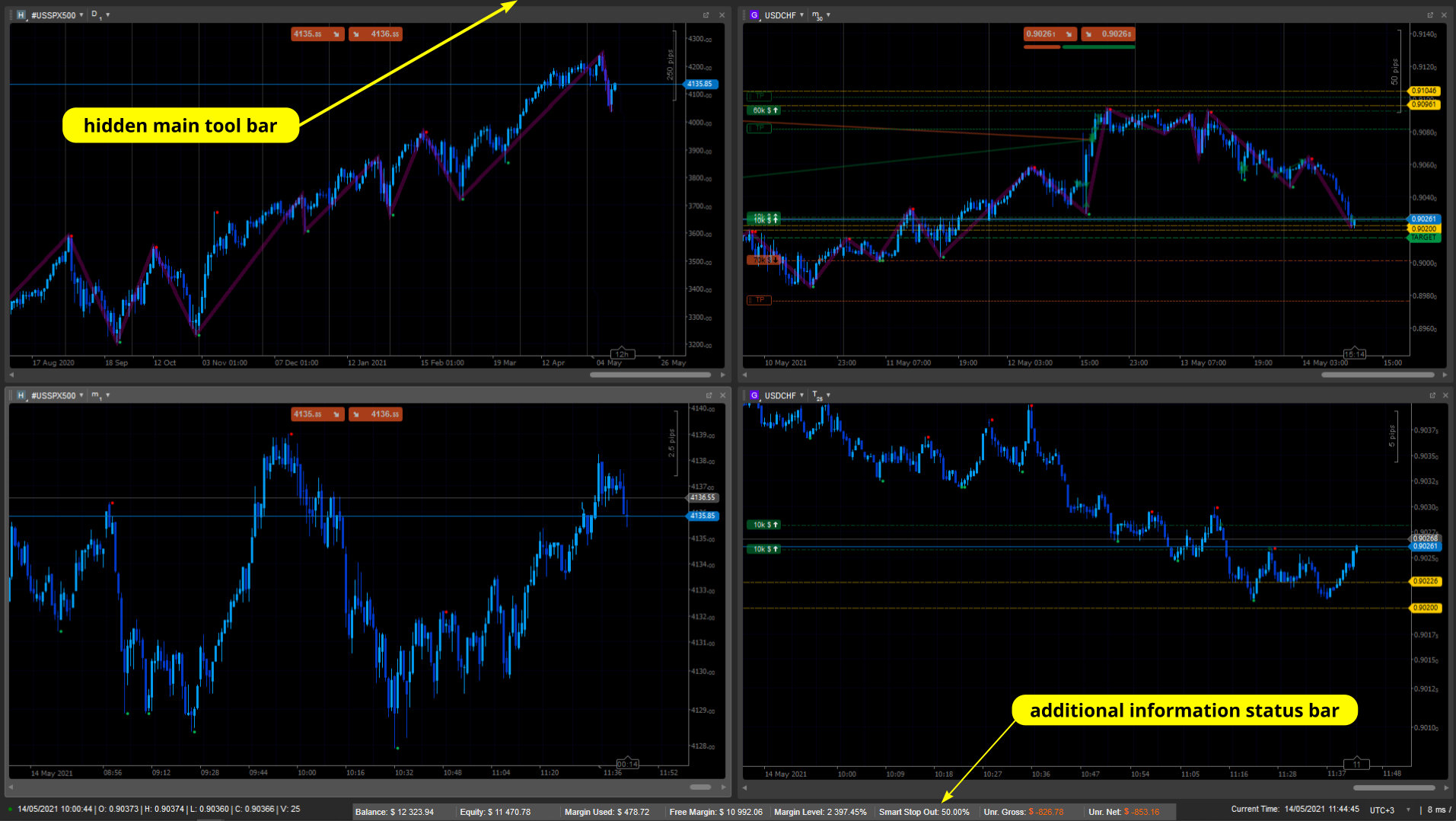
-
Really appreciate your attention!
Best regards and best wishes!
