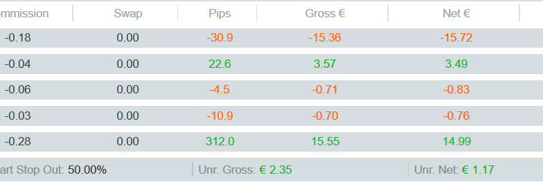
In the light theme: Green and red should be darker for better contrast
Created at 08 Feb 2021, 22:32
GR
In the light theme: Green and red should be darker for better contrast
08 Feb 2021, 22:32
Please consider changing the colors to a darker green and red.
Especially the red is on the grey very hard to read. Even worse over RDP.
Cheers


PanagiotisCharalampous
09 Feb 2021, 08:04
Hi GridSurfer,
Please consider using the Suggestions section for your suggestions.
Best Regards,
Panagiotis
Join us on Telegram
@PanagiotisCharalampous