Latest Update: Change in lines in drawing on screen
09 Sep 2020, 06:42
Hello,
With the last update (received Sep. 8, 2020) of the Desktop version all lines in the drawings on the screen look quite different from those just a few days ago: for instance the "dash-dotted" line now looks as "dotted" line, the "dotted" line now is different and the spaces are much greater. The end effect of all those "changes" is if I am looking at my charts for the first time and I don't like the new look!
I am really unhappy with that! I spend all day looking at those charts and you can't change the way drawing look on a whim. It is quite unprofessional to say the least.
Hope you would quickly revert to the old look of lines setup or at least NEVER change them again!
Take notice!
Replies
heliodorstar
09 Sep 2020, 11:49
( Updated at: 21 Dec 2023, 09:22 )
RE:
PanagiotisCharalampous said:
Hi heliodorstar,
Can you please send us some screenshots of the issue so that we can check?
Best Regards,
Panagiotis
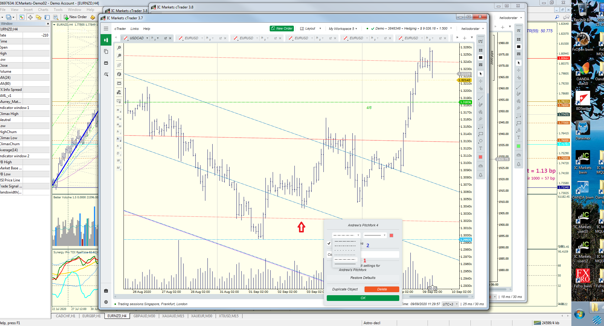
Here is a picture of 3.7 (the origianl drawing lines)

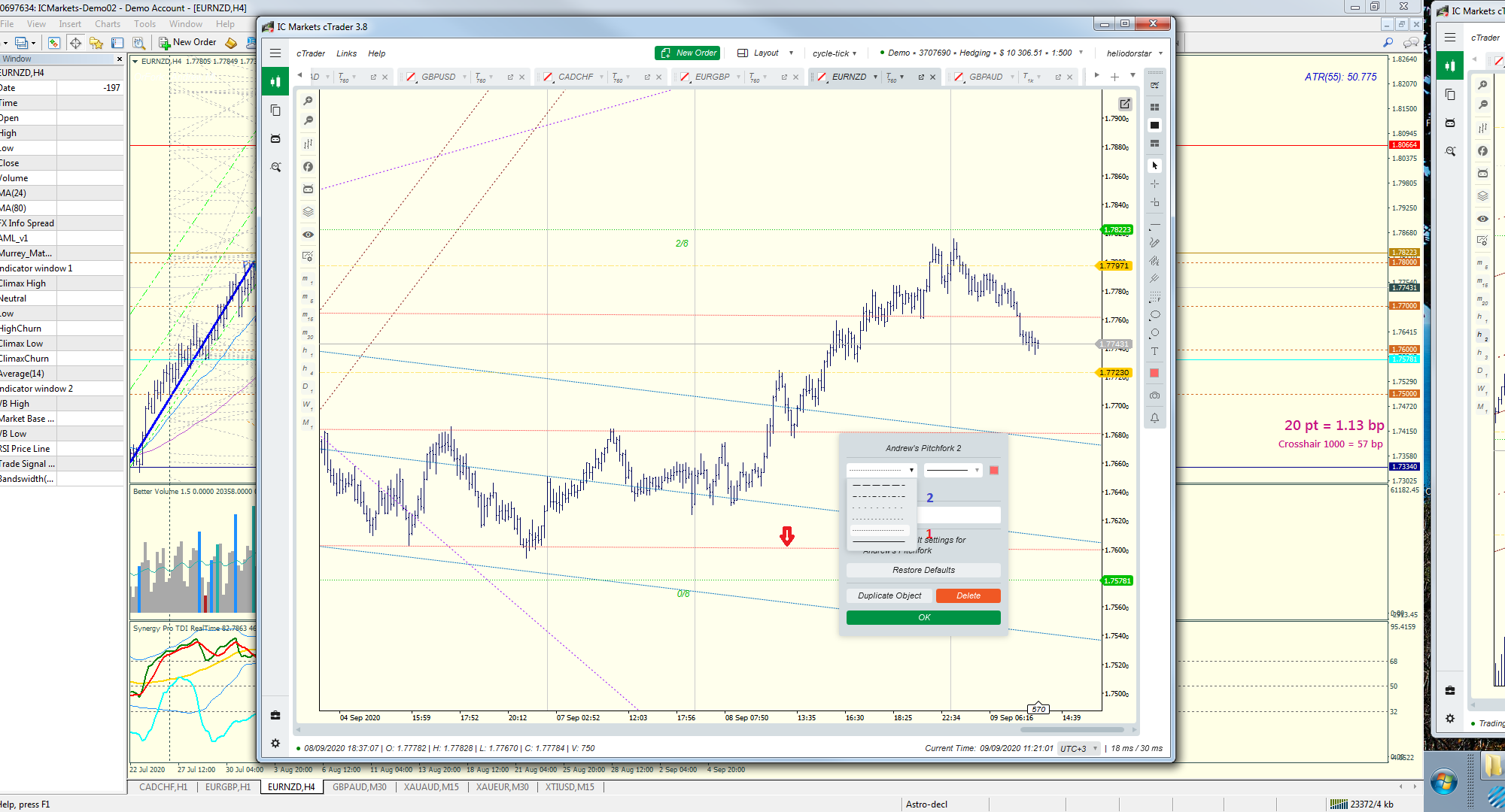
And here is the new version (3.8)

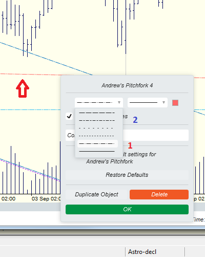
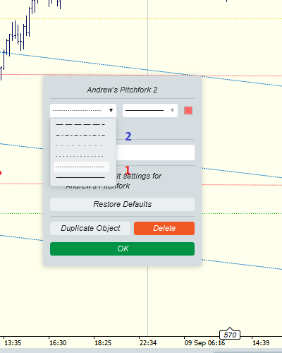
On both screenshots a pitchfork in the same red color is drawn. In 3.7 the line used to be "dash-dotted" line and now the same line is just "dotted line". In the context menu you can the difference between the lines marked with red "1" and blue "2".
Hope the problem is clear enough...
EDIT: Not sure if you can see the difference clearly:
Bigger view of 3.7:

And bigger version of 3.8:

@heliodorstar
PanagiotisCharalampous
09 Sep 2020, 11:56
Hi heliodorstar,
If you notice, the problem is in 3.7. The dash-dotted line was available twice. This has been fixed in 3.8.
Best Regards,
Panagiotis
@PanagiotisCharalampous
heliodorstar
09 Sep 2020, 12:09
RE:
PanagiotisCharalampous said:
Hi heliodorstar,
If you notice, the problem is in 3.7. The dash-dotted line was available twice. This has been fixed in 3.8.
Best Regards,
Panagiotis
Well, the pattern of the line on second row (blue "2") is not the same as the one on the 5th row (red "1").
So it is not a bug and you didn't fixed it! You just made a change you shouldn't have done!
The dotted lines on rows 3rd and 4th are also different. I am not going to make screenshots of them too since it seems it is OK with you.
I wonder if someone has written an indicator using the design of those lines how does he feel about the new design now? And what about if anyone has actually bought that indicator - how does he feel about that too? Do you happen to ask yourselves questions like these?
@heliodorstar

PanagiotisCharalampous
09 Sep 2020, 07:56
Hi heliodorstar,
Can you please send us some screenshots of the issue so that we can check?
Best Regards,
Panagiotis
Join us on Telegram
@PanagiotisCharalampous