Introducing Chart Controls in Automate API

Introducing Chart Controls in Automate API
24 Jul 2019, 09:17
cTrader Automate 3.6 introduces a new concept of custom UI on charts for cBots and indicators.
Remark:
Developers familiar with WPF (Windows Presentation Framework) will find many things similar to it. This is because under the hood cTrader will translate all UI elements from Automate API to WPF UI elements.
Panels
Panels are containers for controls and other panels. Panels have a method AddChild where you pass a child element which can be a control or another panel.
To show custom UI on the chart you need to call Chart.AddControl method with the element you want to see on the chart. Usually, you will create a visual tree with panels and controls using Panel.AddChild method and then you will add the root panel to the chart.
There are five different panels that implement different layouts. Layout rules control how child elements are positioned and sometimes what size child element should have.
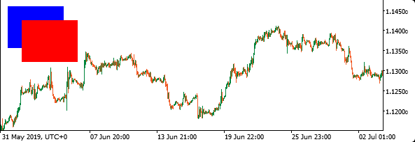
Canvas
Canvas has a simple layout, where each child has an absolute position value. The base class for all controls and panels has 4 properties:
- Left
- Top
- Right
- Bottom
These properties have an effect only when the element is placed inside the Canvas panel. It defines the element positions from the corresponding edge of the parent panel.
Top and Left properties have priority over Bottom and Right. Which means if you specify both Top and Bottom, only Top will be used.
Canvas panel should be used when you want to have explicit control over coordinates inside the panel.
var blueRectangle = new Rectangle()
{
    Width = 80,
    Height = 60,
    FillColor = Color.Blue,
    Left = 10,
    Top = 10
};

var redRectangle = new Rectangle()
{
    Width = 80,
    Height = 60,
    FillColor = Color.Red,
    Left = 30,
    Top = 30
};

var canvas = new Canvas();
canvas.AddChild(blueRectangle);
canvas.AddChild(redRectangle);
Chart.AddControl(canvas);
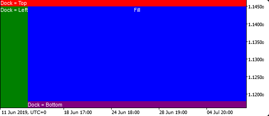
DockPanel
A DockPanel is used to dock child elements in the left, right, top and bottom positions of the remaining space available in DockPanel.
You should set desired positions for child element using Dock property.
By default, DockPanel will fill the remaining space with the last element. You can disable this behavior by setting DockPanel.LastChildFill property to false.
var text1 = new TextBlock()
{
    BackgroundColor = Color.Red,
    Text = "Dock = Top",
    Dock = Dock.Top
};

var text2 = new TextBlock()
{
    BackgroundColor = Color.Green,
    Text = "Dock = Left",
    Dock = Dock.Left
};

var text3 = new TextBlock()
{
    BackgroundColor = Color.Purple,
    Text = "Dock = Bottom",
    Dock = Dock.Bottom
};

var text4 = new TextBlock()
{
    BackgroundColor = Color.Blue,
    TextAlignment = TextAlignment.Center,
    Text = "Fill"
};

var dockPanel = new DockPanel();
dockPanel.AddChild(text1);
dockPanel.AddChild(text2);
dockPanel.AddChild(text3);
dockPanel.AddChild(text4);
Chart.AddControl(dockPanel);
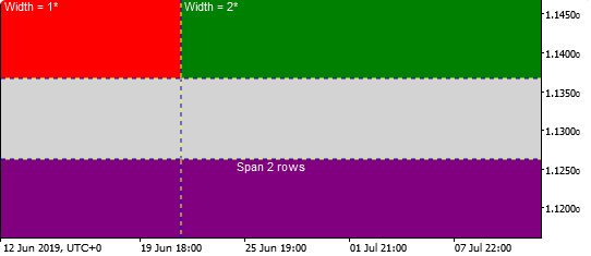
Grid
A Grid allows you to describe columns and rows and place elements into specific cells.
Height for rows and width for columns can be specified in absolute values, using proportions of the available space or it can be set to automatic sizing.
By default when you place control in a grid it will take one cell. If you want it to take more than one row or cell, you can use span parameters in AddChild method.
var text1 = new TextBlock()
{
    BackgroundColor = Color.Red,
    Text = " Width = 1*"
};

var text2 = new TextBlock()
{
    BackgroundColor = Color.Green,
    Text = " Width = 2*"
};

var text3 = new TextBlock()
{
    BackgroundColor = Color.Purple,
    Text = "Span 2 rows",
    TextAlignment = TextAlignment.Center
};

// Creating Grid with 3 rows and 2 columns
var grid = new Grid(3, 2)
{
    BackgroundColor = Color.LightGray,
    ShowGridLines = true
};

// Setting column width using stars
grid.Columns[0].SetWidthInStars(1);
grid.Columns[1].SetWidthInStars(2);

grid.AddChild(text1, 0, 0);
grid.AddChild(text2, 0, 1);

// Adding text with a span of 2 columns
grid.AddChild(text3, 2, 0, 1, 2);

Chart.AddControl(grid);
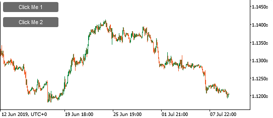
StackPanel
A StackPanel enables you to "stack" elements in an assigned direction. The stack direction can be set to horizontal or vertical using Orientation property.
var button1 = new Button()
{
    Text = "Click Me 1",
    Margin = 5
};

var button2 = new Button()
{
    Text = "Click Me 2",
    Margin = 5
};

var stackPanel = new StackPanel()
{
    Width = 120,
    HorizontalAlignment = HorizontalAlignment.Left
};

stackPanel.AddChild(button1);
stackPanel.AddChild(button2);

Chart.AddControl(stackPanel);
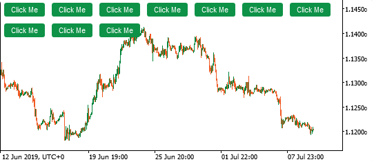
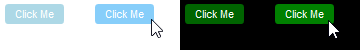
Wrap Panel
The WrapPanel will place child elements next to the other, horizontally or vertically. When there is no space it will continue on the next line.
When the WrapPanel uses the Horizontal orientation, the child controls will be given the same height, based on the tallest item. When the WrapPanel is the Vertical orientation, the child controls will be given the same width, based on the widest item.
var wrapPanel = new WrapPanel();

for (var i = 0; i < 10; i++)
{
    var button = new Button
    {
        Text = "Click Me",
        BackgroundColor = "#0E9247",
        Margin = 5
    };

    wrapPanel.AddChild(button);
}

Chart.AddControl(wrapPanel);
Controls
Controls are the building blocks of UI which allow displaying content and receive users input.
There are multiple common properties that you can use for controls.
Background color can be set using BackgroundColor property. For controls that contain text, you can set text color using ForegroundColor. Also, you can use FontSize, FontWeight, FontStyle, and FontFamily properties.
Below you can find the list of controls available.
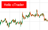
TextBlock
TextBlock in a non-interactive control to display one line or multi-line text.
var text = new TextBlock
{
    BackgroundColor = Color.Red,
    ForegroundColor = Color.White,
    Text = "Hello cTrader",
    Padding = "8 4",
    VerticalAlignment = VerticalAlignment.Top,
    HorizontalAlignment = HorizontalAlignment.Left,
    Margin = 5
};
Chart.AddControl(text);
There are multiple properties for TextBlock to control its behavior. For example, if you have a fixed-width control and you need to display a long text that will be cut off, you can set TextTrimming property to CharacterEllipsis. Then the text will be displayed like this:
Really long sente...
TextBox
TextBox is an interactive input field. You can get an event when its value has changed.
In the example below, we print a log message on each change.
var textBox = new TextBox
{
    Width = 80,
    VerticalAlignment = VerticalAlignment.Top,
    HorizontalAlignment = HorizontalAlignment.Left,
    Margin = 5
};
textBox.TextChanged += e => Print(e.TextBox.Text);
Chart.AddControl(textBox);
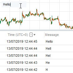
There are multiple useful properties for TextBox to control scroll bars visibility, maximum length, etc.
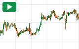
Button
Button can have a simple text as a label or you can use other controls or even a panels as buttons content.
For the first case, you should set the Text property. For the second one, you should use the Content property.
In the example below, we create a button with a play icon and print a log message on every click.
var playIcon = new Polygon()
{
    Points = new Point[] { new Point(0, 0), new Point(10, 6), new Point(0, 12) },
    FillColor = Color.White
};
var button = new Button
{
    Content = playIcon,
    BackgroundColor = "#0E9247",
    VerticalAlignment = VerticalAlignment.Top,
    HorizontalAlignment = HorizontalAlignment.Left,
    Margin = 5,
    Padding = "10 4 8 4"
};
button.Click += e => Print("Play button clicked");
Chart.AddControl(button);
ToggleButton, CheckBox, and RadioButton
These controls can be used to select/deselect one or multiple options.
ToggleButton can be only in checked or unchecked states.
CheckBox can be in three states if you set IsThreeState property to true, checked, unchecked, and indeterminate.
And there could be only one selected RadioButton per group. Which can be set using GroupName property.
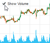
Below is an example of showing and hiding tick volume on the chart using CheckBox.
var checkBox = new CheckBox()
{
    Text = "Show Volume",
    IsChecked = Chart.DisplaySettings.TickVolume,
    VerticalAlignment = VerticalAlignment.Top,
    HorizontalAlignment = HorizontalAlignment.Left,
    Margin = 5
};
checkBox.Click += e => Chart.DisplaySettings.TickVolume = e.CheckBox.IsChecked.Value;
Chart.AddControl(checkBox);
Image
Image source can be set using resources, which now can be added only using Visual Studio.
To add an image as a resource, open cBot or indicator in Visual Studio, right-click your project in Solution Explorer, click Add -> New Item, and Select Resource File.
Resource1.resx file will be added and opened by Visual Studio. Drag and drop one or multiple image files to the opened resx file and save it.
After that, you can use image resource using Resource1.<your file name without extension>. For example, if you added ctrader.png, you can set image source like this:
Image.Source = Resource1.ctrader
var image = new Image()
{
    Source = Resource1.ctrader,
    Stretch = Stretch.None,
    VerticalAlignment = VerticalAlignment.Top,
    HorizontalAlignment = HorizontalAlignment.Left
};
Chart.AddControl(image);
ScrollViewer
ScrollViewer allows adding scroll bars to a content that is larger in size than the area where it should be displayed.
You can set control or a panel as ScrollViewers content.
Visibility of scroll bars can be controlled using HorizontalScrollBarVisibility and VerticalScrollBarVisibility properties. By default horizontal scroll is disabled and vertical is set to Auto, which means that it will be displayed only if needed.
var image = new Image()
{
    Source = Resource1.ctrader,
    Stretch = Stretch.None,
    VerticalAlignment = VerticalAlignment.Top,
    HorizontalAlignment = HorizontalAlignment.Left
};
var scrollViewer = new ScrollViewer()
{
    Content = image,
    Width = 120,
    Height = 60,
    HorizontalScrollBarVisibility = ScrollBarVisibility.Auto,
    VerticalAlignment = VerticalAlignment.Top,
    HorizontalAlignment = HorizontalAlignment.Left
};
Chart.AddControl(scrollViewer);
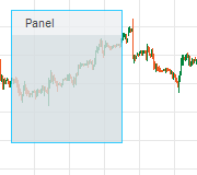
Border
Border is a customizable visual box for a child element. You can use Border to wrap a control or a panel and set background color, border thickness, border color, and rounding corners.
var panel = new StackPanel()
{
    Orientation = Orientation.Vertical,
    Width = 100,
    Height = 120,
    BackgroundColor = "#D5DDE1",
};
var titleBar = new StackPanel()
{
    Orientation = Orientation.Horizontal,
    BackgroundColor = "#ECEFF1"
};
var titleLable = new TextBlock()
{
    Text = "Panel",
    Margin = "12 4"
};
titleBar.AddChild(titleLable);
panel.AddChild(titleBar);
var panelBorder = new Border()
{
    Child = panel,
    BorderColor = Color.DeepSkyBlue,
    BorderThickness = 1,
    Opacity = 0.8,
    VerticalAlignment = VerticalAlignment.Top,
    HorizontalAlignment = HorizontalAlignment.Left,
    Margin = 10
};
Chart.AddControl(panelBorder);
Alignment
The HorizontalAlignment and VerticalAlignment properties describe how a child element should be positioned within a parent element.
The HorizontalAlignment property can be set to Left, Center, Right, and Stretch.
The VerticalAlignment property can be set to Top, Center, Bottom, and Stretch.
When Stretch is set, the element will try to fill the parent space, unless explicit Width and Height values are specified for that element. Stretch is a default value for both horizontal and vertical alignment. That is why if you add control or a panel to the chart using Chart.AddControl method, it will be stretched to the whole charts area.
The HorizontalContentAlignment and VerticalContentAlignment properties used to align a control’s content. For example, if you want a button's content to be aligned to the right side, you can set button.HorizontalContentAlignment = HorizontalAlignment.Right.
Sizing
Panels and controls will try to fill the space based on the size of its content unless it is stretched to fill the parent size.
You can override the desired size by specifying an explicit size using Width and Height properties. Also, you can limit the desired size using MaxHeight, MaxWidth, MinHeight, and MinWidth properties.
Margin property specifies the outer spacing between the edges of the control and its container. It consists of four values Left, Top, Right, and Bottom.
Padding property specifies the inner spacing between the edges of the control and its content. Also, consist of the same four values.
Both Margin and Padding are of type Thickness and can be specified in multiple ways.
Same value for all 4 sides:
button.Margin = new Thickness(5);
button.Margin = 5;
button.Margin = "5";
Individual values:
button.Margin = new Thickness(1, 2, 3, 4);
button.Margin = "1 2 3 4";
Same for Left-Right and Top-Bottom:
button.Margin = "1 4";
Visiblility and disabling mouse interaction
IsVisible property determines if an element should be visible and space should be reserved for it.
Opacity can be set from 0 (completely opaque) to 1 (default).
IsEnabled allows you to change interactivity of controls such as button or checkbox. When you set it to false, a user can not interact with it.
IsHitTestVisible determines if control or a panel visible to the mouse. If you set it to false, element under the control will get mouse events. If there are no elements, the chart will handle mouse events.
Styling
Styles allow you to set visual properties of control for different states. For example, style can specify how a button looks in hovered state and in pressed state.
Also, styling can be done for dark and light themes. If you specify styles for each theme, it will be automatically applied when a user switches between themes in cTrader.
Style is a class that contains the rules for visual appearance. You create an instance of the Style class and add the rules using the Set method.
States can be combined together. The more specific state takes precedence over less specific.
The example below shows a button that has different colors for normal and hover states for both dark and light themes.
var buttonStyle = new Style();
buttonStyle.Set(ControlProperty.BackgroundColor, Color.LightBlue, ControlState.LightTheme);
buttonStyle.Set(ControlProperty.BackgroundColor, Color.LightSkyBlue, ControlState.LightTheme | ControlState.Hover);
buttonStyle.Set(ControlProperty.BackgroundColor, Color.DarkGreen, ControlState.DarkTheme);
buttonStyle.Set(ControlProperty.BackgroundColor, Color.Green, ControlState.DarkTheme | ControlState.Hover);
var button = new Button()
{
    Text = "Click Me",
    Style = buttonStyle,
    VerticalAlignment = VerticalAlignment.Top,
    HorizontalAlignment = HorizontalAlignment.Left,
    Margin = 5
};
Chart.AddControl(button);
Almost all controls have default styles assigned to each new instance when you create it. You can remove style by setting Style = null or replace it with your style. Also, default styles can be accessed using DefaultStyles static class. You can create your style inherited from default one like this: var buttonStyle = new Style(DefaultStyles.ButtonStyle);
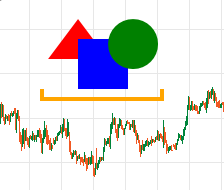
Shapes
There are 5 shapes available. Rectangle, Ellipse, Line, Polygon, and Polyline.
var triangle = new Polygon
{
    Points = new[] { new Point(30, 0), new Point(60, 40), new Point(0, 40) },
    FillColor = Color.Red,
    Top = 20,
    Left = 50
};

var rectangle = new Rectangle
{
    FillColor = Color.Blue,
    Width = 50,
    Height = 50,
    Top = 40,
    Left = 80
};

var ellipse = new Ellipse
{
    FillColor = Color.Green,
    Width = 50,
    Height = 50,
    Top = 20,
    Left = 110
};

var polyLine = new Polyline
{
    Points = new[] { new Point(0, 0), new Point(0, 10), new Point(120, 10), new Point(120, 0) },
    StrokeColor = Color.Orange,
    StrokeThickness = 4,
    Top = 90,
    Left = 44
};

var canvas = new Canvas();
canvas.AddChild(triangle);
canvas.AddChild(rectangle);
canvas.AddChild(ellipse);
canvas.AddChild(polyLine);
Chart.AddControl(canvas);
Replies
PanagiotisCharalampous
24 Jul 2019, 16:50
Hi Ahmad,
No at the moment it is not possible. You can only add a CustomControl class which can only contain Chart API elements. See below an example
public class BuySellButtons : CustomControl
{
    public event Action BuyButtonClick;
    public event Action SellButtonClick;

    public BuySellButtons()
    {
        var buyButton = new Button
        {
            Text = "Buy",
            Width = 80
        };

        var sellButton = new Button
        {
            Text = "Sell",
            Width = 80,
            Margin = "5 0 0 0"
        };

        var stackPanel = new StackPanel
        {
            Orientation = Orientation.Horizontal
        };
        stackPanel.AddChild(buyButton);
        stackPanel.AddChild(sellButton);
        AddChild(stackPanel);

        buyButton.Click += args => BuyButtonClick.Invoke();
        sellButton.Click += args => SellButtonClick.Invoke();
    }
}
var tradeButtons = new BuySellButtons
{
    VerticalAlignment = VerticalAlignment.Top,
    HorizontalAlignment = HorizontalAlignment.Left,
    Margin = 5
};

Chart.AddControl(tradeButtons);
tradeButtons.BuyButtonClick += () => Print("Buy button clicked");
tradeButtons.SellButtonClick += () => Print("Sell button clicked");
Best Regards,
Panagiotis
@PanagiotisCharalampous
bart1
26 Jul 2019, 16:38
( Updated at: 21 Dec 2023, 09:21 )
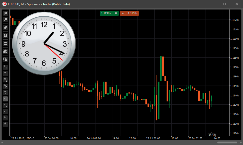
I don't know what for, but here you are. Analog clock on the chart
https://ctrader.com/algos/indicators/show/1975
@bart1
AlgoCorner
16 Aug 2019, 02:25
Hello Spotware, thanks for these additions, they are really helpful.
I have two questions:
What is the "IsHitTestVisible" property for? can we get an example?
My second question might be a request also, it seems we can't modify the grid lines inside a Grid, it would be nice to change the style, width, and color, I can use BorderPanel to circumvent this issue for the moment.
Best Regards,
@AlgoCorner
PanagiotisCharalampous
26 Aug 2019, 15:10
Hi Xavier,
What is the "IsHitTestVisible" property for? can we get an example?
That is a WPF property, you camnread more here and here.
My second question might be a request also, it seems we can't modify the grid lines inside a Grid, it would be nice to change the style, width, and color, I can use BorderPanel to circumvent this issue for the moment.
I will forward this suggestion to the product team
Best Regards,
Panagiotis
@PanagiotisCharalampous
AlgoCorner
17 Sep 2019, 07:45
Hello Panagiotis, thanks for your support.
Can you tell me which FamilyFont types are supported? it seems I have to guess, enums for this would be nice.
Another suggestion, the grid should be improved to access and edit objects by index [row, colum], I don't see options to do this, there are only options to remove entire rows or columns.
The .AddChild() property includes row, column parameters, but the .RemoveChild() does not.
I hope this or something similar gets added before 3.6 is released.
Thanks
@AlgoCorner
PanagiotisCharalampous
17 Sep 2019, 14:00
Hi Xavier,
All fonts installed on your PC are supported. You can specify multiple fonts seperated by comma. The first font found will be used or it will fall back to the default one, if no fonts found.
Regarding the question about the grid. RemoveRowAt and RemoveColumnAt do not remove child elements. E.g. if you remove the third row, the child in this row will be moved to the second one.
RemoveChild() method has only a child parameter. A child element will be removed regardless of the row and column. So for RemoveChild there is no need to know about row and column of the child
Best Regards,
Panagiotis
@PanagiotisCharalampous
AlgoCorner
18 Sep 2019, 08:49
Thanks for replying,
I'm sorry, what I was actually trying to suggest by improving RemoveChild() is that it should have an overload to just remove by index [Column,Row], or know by these if a "cell" has any child in it, we can make workarounds for it, but it would be nice to have it.
Thanks for the font tips as well.
Best Regards,
Xavier R.
@AlgoCorner
AlgoCorner
27 Sep 2019, 19:16
( Updated at: 21 Dec 2023, 09:21 )
I'm not sure if this is a bug or a feature, the text is shown above the price axis, how can I edit or fix this? Chart.Width should not consider this axis area.
Thanks for your support.
@AlgoCorner
PanagiotisCharalampous
10 Oct 2019, 11:56
Hi Xavier R,
This is a bug. We will fix it in an update.
Best Regards,
Panagiotis
@PanagiotisCharalampous
paul.williams125
03 Dec 2019, 19:56
PRESS BUTTON - TO RUN MORE THAN ONE EVENT
//-----------------------------------------------------------
// PRESS BUTTON - TO RUN MORE THAN ONE EVENT
//-----------------------------------------------------------
// ---------- This to be added just before protected override void Initialize() and OnStart() below The Declaration of supplementary objects and variables Area.
int x =0;
public event Action On;
public event Action Off;
//-----------------------------------------------------------
//----------- This code must be added Only to - protected override void Initialize() and OnStart() otherwise freezes - for good reason..
var buttonStyle = new Style();
buttonStyle.Set(ControlProperty.BackgroundColor, Color.Red, ControlState.DarkTheme);
buttonStyle.Set(ControlProperty.BackgroundColor, Color.Green, ControlState.DarkTheme | ControlState.Checked);
var checkBox = new CheckBox
{
Style = buttonStyle,
Width = 50,
Height = 200,
VerticalAlignment = VerticalAlignment.Top,
HorizontalAlignment = HorizontalAlignment.Right,
Margin = 5,
Padding = "10 4 10 4"
};
checkBox.Checked += args => On.Invoke();
On += () =>
{
x = 2;
if (x == 2)
Chart.DrawStaticText("NOTES3", "\nHELLO ", VerticalAlignment.Top, HorizontalAlignment.Center, Color.White);
//-----------write your code. for when the button is clicked on, and turns Green.
};
checkBox.Unchecked += args => Off.Invoke();
Off += () =>
{
x = 3;
if (x == 3)
Chart.DrawStaticText("NOTES3", "\nGOODBYE ", VerticalAlignment.Top, HorizontalAlignment.Center, Color.White);
//-----------write your code. for when the button is clicked Off, and turns Red.
//-----------Please note .. you can only use the variables here, x is only 3 while here, and will not change in your main program, when the button is pressed.
};
Chart.AddControl(checkBox);
@paul.williams125
... Deleted by UFO ...
dordkash@gmail.com
22 Mar 2020, 09:51
( Updated at: 21 Dec 2023, 09:21 )
RE:
var checkBox = new CheckBox()
{
    Text = "Show Volume",
    IsChecked = Chart.DisplaySettings.TickVolume,
    VerticalAlignment = VerticalAlignment.Top,
    HorizontalAlignment = HorizontalAlignment.Left,
    Margin = 5
};
checkBox.Click += e => Chart.DisplaySettings.TickVolume = e.CheckBox.IsChecked.Value;
Chart.AddControl(checkBox);
Hi
what is the problem?
            var checkBox = new CheckBox
            {

                Text = "Show SYMBOLS",
                IsChecked = Chart.AddControl(STMU),
                VerticalAlignment = VerticalAlignment.Top,
                HorizontalAlignment = HorizontalAlignment.Left,
                Margin = "70 0"
            };
            checkBox.Click += e => Chart.AddControl(STMU) = e.CheckBox.IsChecked.Value;
            Chart.AddControl(checkBox);
Error CS0029: Cannot implicitly convert type 'void' to 'bool?'
Error CS0131: The left-hand side of an assignment must be a variable, property or indexer
Error CS0029: Cannot implicitly convert type 'bool' to 'void'
@dordkash@gmail.com
PanagiotisCharalampous
23 Mar 2020, 08:54
( Updated at: 21 Dec 2023, 09:21 )
RE: RE:
dordkash@gmail.com said:
var checkBox = new CheckBox()
{
    Text = "Show Volume",
    IsChecked = Chart.DisplaySettings.TickVolume,
    VerticalAlignment = VerticalAlignment.Top,
    HorizontalAlignment = HorizontalAlignment.Left,
    Margin = 5
};
checkBox.Click += e => Chart.DisplaySettings.TickVolume = e.CheckBox.IsChecked.Value;
Chart.AddControl(checkBox);
Hi
what is the problem?var checkBox = new CheckBox { Text = "Show SYMBOLS", IsChecked = Chart.AddControl(STMU), VerticalAlignment = VerticalAlignment.Top, HorizontalAlignment = HorizontalAlignment.Left, Margin = "70 0" }; checkBox.Click += e => Chart.AddControl(STMU) = e.CheckBox.IsChecked.Value; Chart.AddControl(checkBox);Error CS0029: Cannot implicitly convert type 'void' to 'bool?'
Error CS0131: The left-hand side of an assignment must be a variable, property or indexer
Error CS0029: Cannot implicitly convert type 'bool' to 'void'
Hi,
Your problem is here
IsChecked = Chart.AddControl(STMU)
What are you trying to do?
Best Regards,
Panagiotis
@PanagiotisCharalampous
dordkash@gmail.com
23 Mar 2020, 10:09
( Updated at: 21 Dec 2023, 09:21 )
RE: RE: RE:
PanagiotisCharalampous said:
dordkash@gmail.com said:
var checkBox = new CheckBox()
{
    Text = "Show Volume",
    IsChecked = Chart.DisplaySettings.TickVolume,
    VerticalAlignment = VerticalAlignment.Top,
    HorizontalAlignment = HorizontalAlignment.Left,
    Margin = 5
};
checkBox.Click += e => Chart.DisplaySettings.TickVolume = e.CheckBox.IsChecked.Value;
Chart.AddControl(checkBox);
Hi
what is the problem?var checkBox = new CheckBox { Text = "Show SYMBOLS", IsChecked = Chart.AddControl(STMU), VerticalAlignment = VerticalAlignment.Top, HorizontalAlignment = HorizontalAlignment.Left, Margin = "70 0" }; checkBox.Click += e => Chart.AddControl(STMU) = e.CheckBox.IsChecked.Value; Chart.AddControl(checkBox);Error CS0029: Cannot implicitly convert type 'void' to 'bool?'
Error CS0131: The left-hand side of an assignment must be a variable, property or indexer
Error CS0029: Cannot implicitly convert type 'bool' to 'void'
Hi,
Your problem is here
IsChecked = Chart.AddControl(STMU)What are you trying to do?
Best Regards,
Panagiotis
I want this command(
Chart.AddControl(STMU)
) to run when the checkbox is selected and to cancel when it is unchecked
This command puts a few buttons on the chart, I want these keys to appear on the chart when checked, and not to show when canceled
@dordkash@gmail.com
PanagiotisCharalampous
23 Mar 2020, 10:26
Hi,
IsChecked is not an event handler but a property. It takes a boolean value. This is why you get the error.
What are you trying to do?
Best Regards,
Panagiotis
@PanagiotisCharalampous
dordkash@gmail.com
23 Mar 2020, 10:39
RE:
PanagiotisCharalampous said:
Hi,
IsChecked is not an event handler but a property. It takes a boolean value. This is why you get the error.
What are you trying to do?
Best Regards,
Panagiotis
I explained above
This command puts a few buttons on the chart, I want these keys to appear on the chart when checked, and not to show when canceled
Thankyou
@dordkash@gmail.com
PanagiotisCharalampous
23 Mar 2020, 10:59
Hi,
I explained to you what is the problem with your code. If you don't know how to solve it or you are not familiar with C# programming, you can ask a professional to help you.
Best Regards,
Panagiotis
@PanagiotisCharalampous
dordkash@gmail.com
23 Mar 2020, 11:11
RE:
PanagiotisCharalampous said:
Hi,
I explained to you what is the problem with your code. If you don't know how to solve it or you are not familiar with C# programming, you can ask a professional to help you.
Best Regards,
Panagiotis
Thank you
@dordkash@gmail.com
... Deleted by UFO ...
... Deleted by UFO ...
PanagiotisCharalampous
23 Apr 2020, 08:32
Hi omidfx10,
Your question is not clear and does not seem to be related to the subject of the thread. Can you please create a new thread and explain your question better?
Best Regards,
Panagiotis
@PanagiotisCharalampous
... Deleted by UFO ...
PanagiotisCharalampous
14 May 2020, 08:42
Hi sunnywilsonstore,
No this is not possible at the moment.
Best Regards,
Panagiotis
@PanagiotisCharalampous
... Deleted by UFO ...
bienve.pf
12 Nov 2020, 21:01
Numeric Box
Ok. TextBox is for text but why haven't you implemented a "NumbericBox" that is only for numbers?
Other events are needed to handle controls like OnBlur / OnLeave / OnFocus
@bienve.pf
... Deleted by UFO ...
amusleh
15 Oct 2021, 08:27
RE: Option to Change Grid Lines Color
RayAdam said:
Hi Support,

Is there a possibility to change the GridLines color/format ?

var grid = new Grid(3, 2)
{
    BackgroundColor = Color.LightGray,
    ShowGridLines = true
};
Thanks
There is no way for changing grid lines color, If you need it then you can open a thread for it on suggestions section.
@amusleh
boris_k
18 Dec 2021, 23:41
( Updated at: 19 Dec 2021, 00:17 )
How to cause the TextBlock repaint?
PanagiotisCharalampous,
I am updating the property Text of the TextBlock by timer.
It just puts the current time to the TextBlock.Text
But the text is not updating in the real time. It updates if I change the time frame only. The indicator just recreate the TextBlock object.
How to repaint the TextBlock to show the actual value of the Text, please?
Thank you!
UPD: Everything is working as expected if I use the Timer as described here https://ctrader.com/api/reference/timer
The System.Timers.Timer does not work. The TextBlock does not repaint.
@boris_k
... Deleted by UFO ...
afhacker
24 Jul 2019, 10:12
This is great, thanks for adding this and supporting WPF controls will open lots of new possibilities.
Is it possible to add a WPF user control which I designed on XAML to the chart? I think it should be possible.
@afhacker