Introducing the new cTrader Mobile Beta
01 Nov 2017, 12:29
Last week we soft launched the new Android & iOS cTrader applications. Unlike all previous updates, this one is published only for the Spotware Public Beta version of cTrader, and it will stay like this for some time, until we collect enough of your valuable feedback and make sure it’s stable and reliable enough for live trading.
This is a new family of cTrader for mobile, reimagined and redeveloped from scratch. They say artificial intelligence will soon be able to write software. We asked Siri, Cortana and Google, but they just kept arguing about which operating system is the best. Finally we had to write it all ourselves. It took a while and after more than a year, a public beta version is here. BTW, we are continuously looking for very experienced, senior mobile .NET developers, if you are one, please contact us immediately!
Let’s take a look at what’s new:
Design and experience
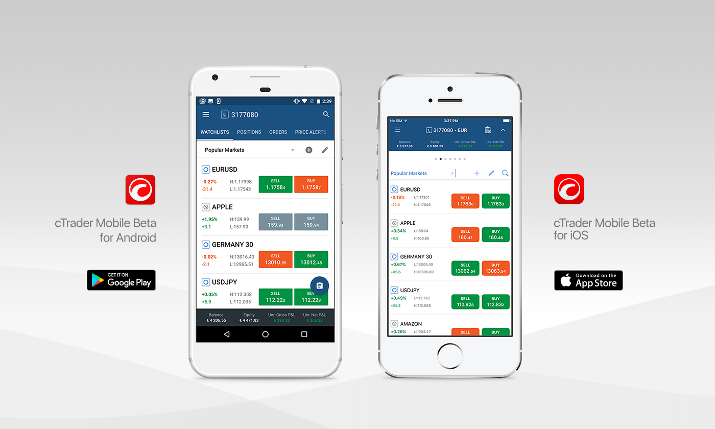
The main idea of 2-level navigation remains:
-
Top level with cloud-based watchlists, positions, orders, price alerts and other trading entities across symbols.
-
Symbol-centric bottom level where all data is dedicated to the selected symbol.
On top of that, we added native Android and iOS design patterns, layouts and controls. The account status bar is located at the bottom on Android, and at the top on iOS. While the Android app employs an action bar with side menu and swipeable tabs, simpler page controls are used in the iOS app. Confirmation buttons are at the bottom of the screen on Android whereas they are at the top on iOS. Long story short, we used native platform controls to give the best possible user experience everywhere we could.
Cloud functionality
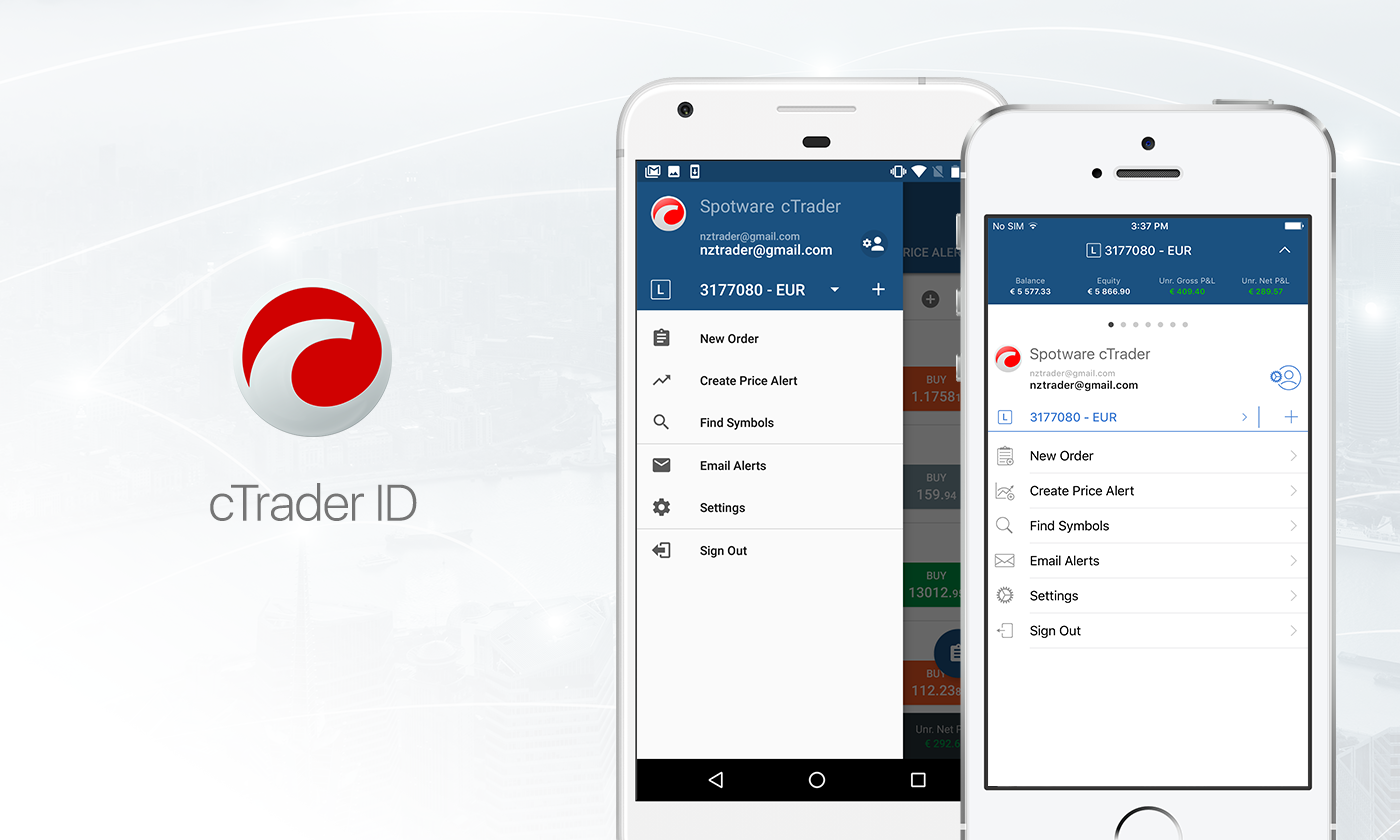
Allowing you to login with cTrader ID or your account number brought many disadvantages to the existing app, all cloud functionality was hidden, even simple thing such as watchlists were not functioning and we kept getting feedback that things are completely wrong.
The new application has all cloud functionality right from the start, including price alerts, email alerts, fast switching between accounts, multiple watchlists. That’s right, finally Price Alerts are accessible at the top level navigation, and easy to use.
Fluid charting

It’s no secret that charting is one of the most important parts of trading applications. We ensured that users will take full advantage of their high-resolution screens and mobile experience.
While in full screen chart mode you can:
-
Swipe in any direction - the chart will move, while preserving the current zoom.
-
Pinch-to-zoom - allows you to zoom in/out, scaling both axes simultaneously or separately.
-
Fling (swipe fast and release finger before stopping the motion) - left and right will move the chart gradually slowing down with auto zooming enabled.
-
Double tap - the chart will re-center and auto zoom.
Last, but not least, many new indicators and time frames were added, now the list of time frames and indicators fully corresponds to Desktop cTrader application.
Trade vs. Quick Trade
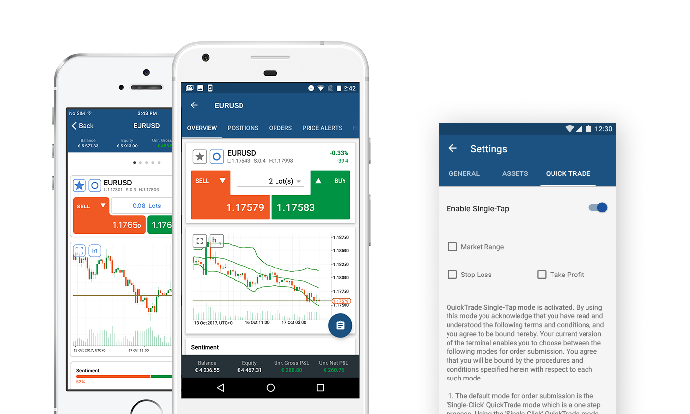
There are two types of trade buttons throughout the app:
-
Simple rectangle shape BUY/SELL button - does not have size/volume selection and simply opens respective symbol new Market or pending Order screen with trade direction preselected.
-
Complex-shape Quick Trade buttons - with size/volume selection between them at the Symbol Overview screen. Tapping these buttons will immediately create a Market Order.
From the app settings you can set additional parameters for using Quick Trade, with options to apply Take Profit, Stop Loss and Market Range with Quick Trade orders, or turn the feature off completely. Be cautious while submitting Quick Trade orders, there is no further confirmation after tapping the Quick Trade button.
Symbol Overview
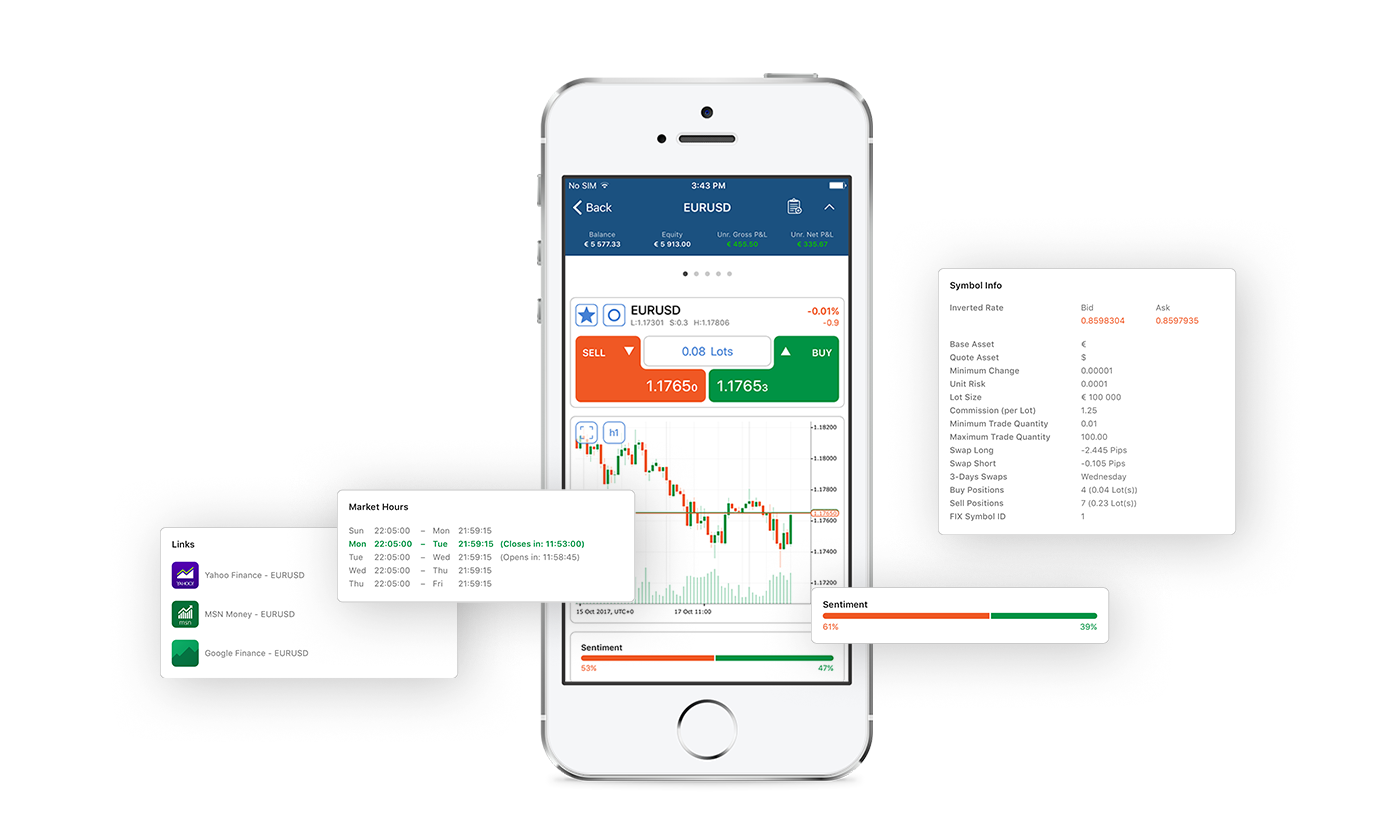
New Symbol Overview screen reflects our endeavour to provide as much symbol info as possible. It is implemented as a long list of sections, including completely new pieces of data like Market Sentiment, Market Hours, links to external news sources and to Trade Statistics.
In-app Notifications
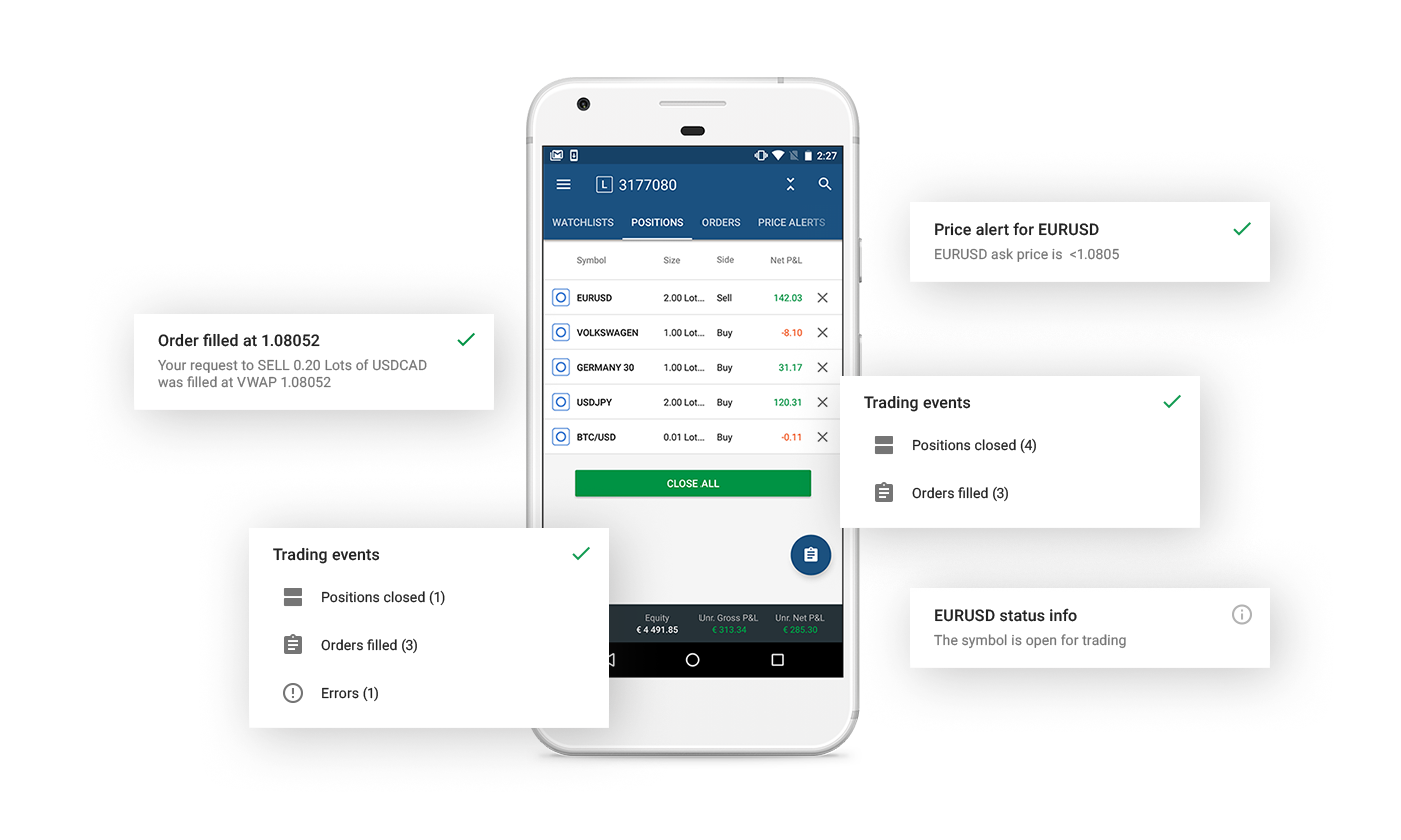
In-app notifications have their own space allocated and they can be dismissed immediately by tapping on them, multiple notifications are being aggregated so they do not cover the whole screen.
Deals History
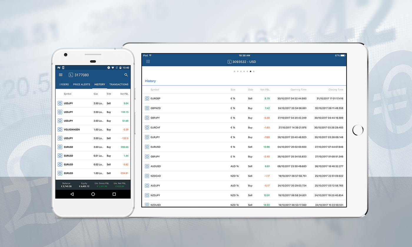
History of Deals has become more informative with all known details being shown in the mobile app. Click on any deal in the list, this hyperlink will navigate to a dedicated page containing the complete range of details for the deal.
Action Button
Inlined with mobile platform guidelines the main action button is located at the top of the screen on iOS and as a bottom floating button on Android. This button is changing it’s action in context with location in the app it’s shown:
-
While at the Watchlist or Positions or Symbol Overview screen it will open a new Market Order screen.
-
At the Orders view it will open a new Limit Order screen.
-
At the Price Alerts view it will open a new Price Alert screen.
-
If the symbol is currently not in session it will direct you to the Limit Order even if otherwise the expected result would be to open the Market Order screen.
Native social authentication
Now you can authenticate with your Google and Facebook account using a native flow provided by the platform. No more annoying popup browser windows and returning back to the application.
Improved connectivity consuming times less data
Connectivity was heavily optimized to consume less data, thus making the operation more stable, less battery intensive. Even 2G connection in most cases is enough for normal operation.
Crash Analytics
We are collecting crash data and fixing it around the clock. Having a rare piece of hardware or mobile platform version, we can still address an issue. Rest assured we don’t collect any personal data.
New Translations
The application has been translated to 5 more languages. The default language is still English. The language can be changed from settings, followed by application restart.
Email Alerts
Email Alerts can be configured separately per each Demo or Live trading account so you can received different alerts for different accounts, hence we decided that you might want to do this from the same screen. Now you can switch account from the Email Alerts screen as well.
Status Bar
The Status Bar now has 3 states, each showing different details. It is located in the footer on Android and in the header on iOS. There is an option to collapse/expand it on iOS and it can be hidden by using Settings on Android. The third state shows more info for most app screens, including Balance and Free Margin.
